
Turn Messy Data Into Meaningful Charts With AI
A quick, repeatable way to create visuals with ChatGPT that actually tell your story
One of the things I’ve been using ChatGPT a lot for recently is something that might sound a bit boring…
But it’s actually made my life way easier: turning raw data into clean, visual graphs.
I’ve used it for internal reporting, blog posts, social content, and even for briefing our design team.
🔍 What’s the insight?
Using ChatGPT to quickly visualise data, removing the need to open Excel, fiddle with formatting, or dig around in Google Sheets for the right chart type.
🛠 What tool am I using?
ChatGPT Plus (this should still work with the free version).
🤖 How does it work?
Step 1: Start a new chat with ChatGPT and use the following prompt:
“I’ve provided a dataset below. Analyze the data carefully and create a clear, visually appealing, and professional-quality graph. Follow these instructions closely:
1. Identify the most suitable chart type (e.g., bar chart, line graph, scatter plot, pie chart, etc.) based on the data provided and the insights I want to communicate.
2. Clearly label all axes, providing units where relevant.
3. Provide a descriptive and concise title.
4. Use clean, minimalist aesthetics (no unnecessary elements).
5. Ensure the graph emphasizes the main insight clearly.
6. Add a brief summary highlighting key insights beneath the graph.
[Paste in your data set]
Step 2: Let ChatGPT work its magic. You should have a clear chat within a few seconds.
Step 3: Review the chart and prompt further if needed. You can ask it to change the colour palette, tweak the labels, or even say, “Make this look more like this example” and upload a screenshot of a chart you like and it will try to match the style.
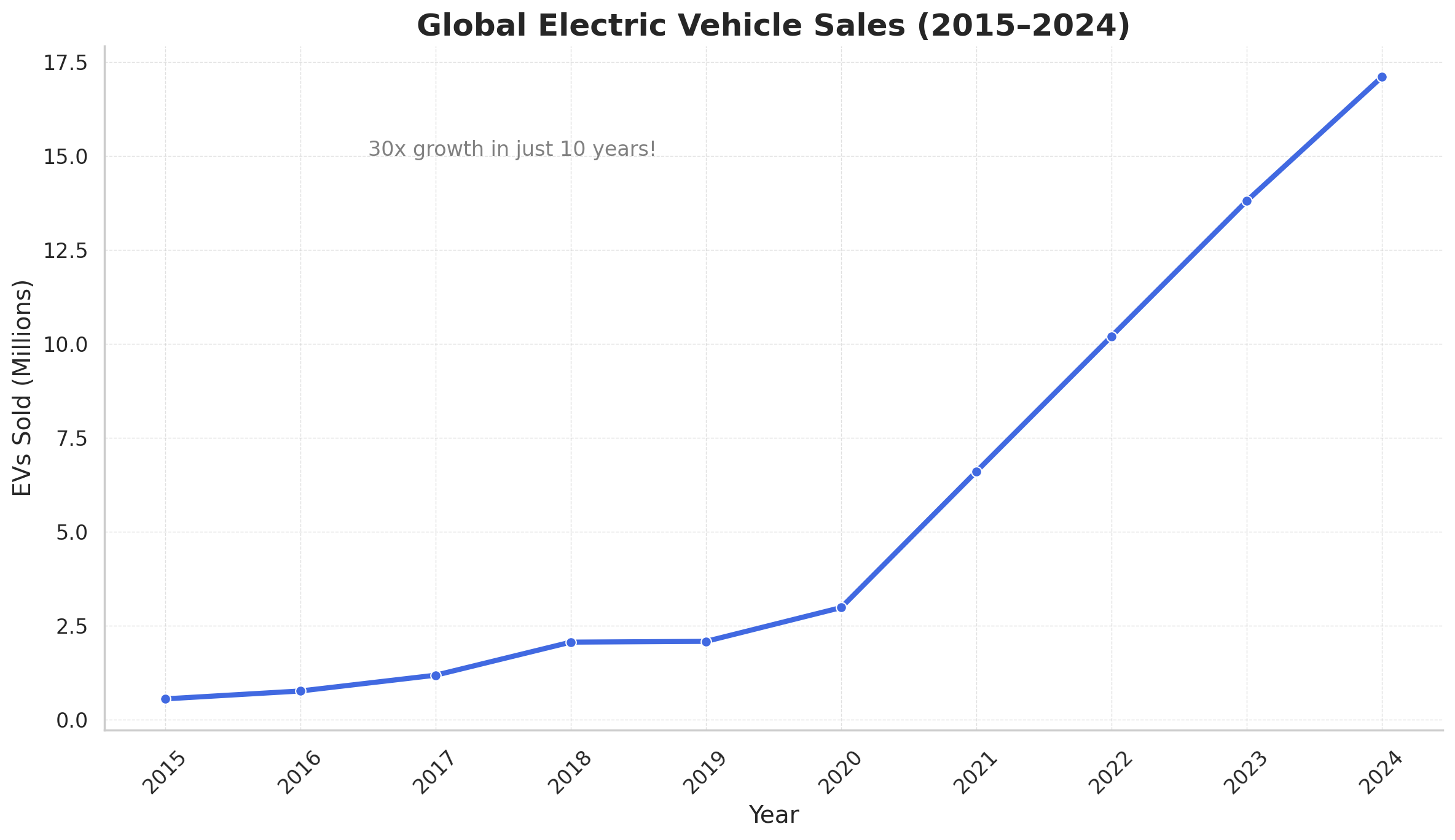
📊 Real example
Here is the chart I got back from ChatGPT after sharing data about the uptake of electric vehicles:
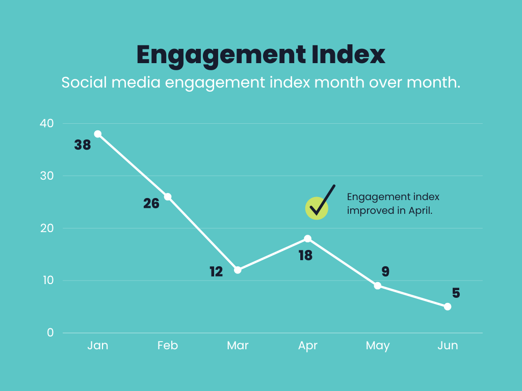
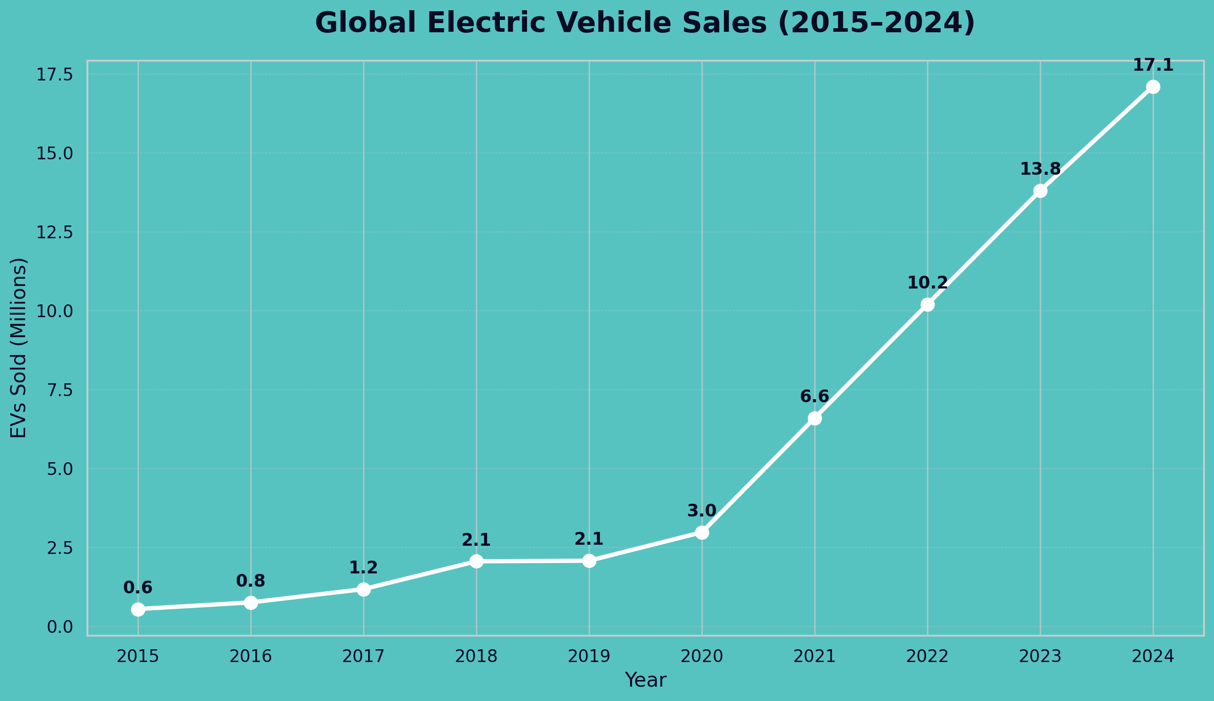
And here is an example chart I used as a template for ChatGPT and the result I got back underneath:
📈 How has this helped me?
It’s helped me process data faster for myself. Tables are great, but visuals hit harder.
It’s sped up internal reporting and made briefs to the design team much clearer.
I’ve used it to turn blog and newsletter data into more engaging content.
And it’s way quicker than building the chart manually every time.
Want more like this? I’ve started regularly sharing what I’m experimenting with in real time over on LinkedIn. Follow me here.